Unlock the Mysteries Behind Prada’s Iconic Logo
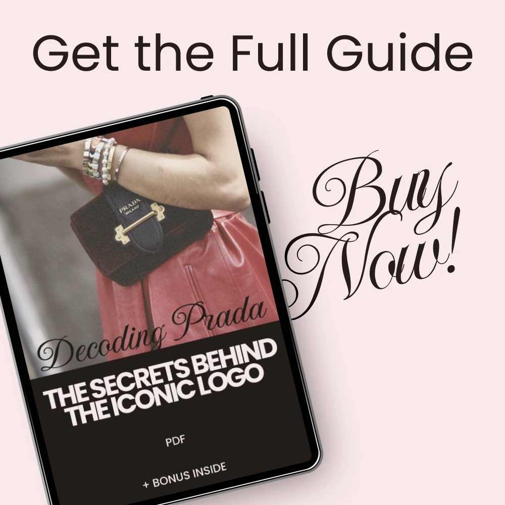
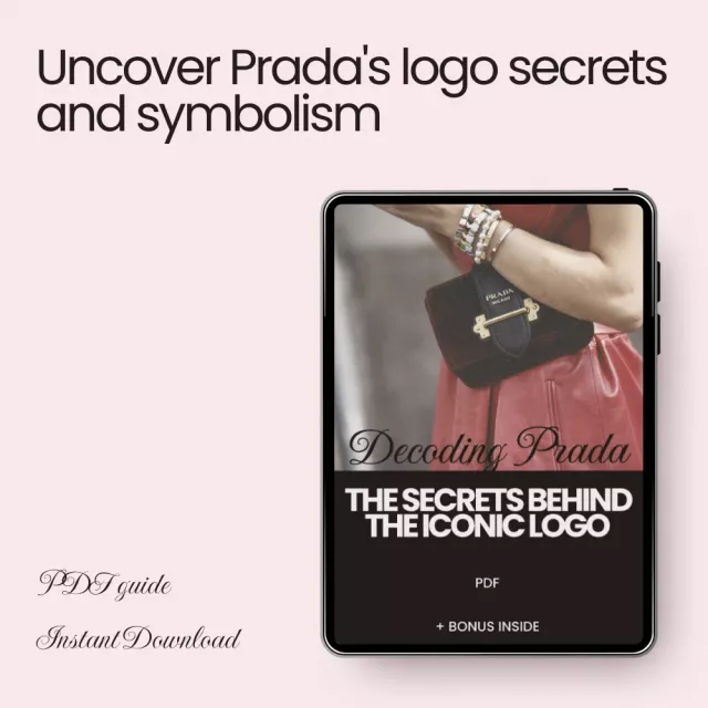
Step into the world of luxury fashion with our comprehensive guide, Decoding Prada: The Secrets Behind the Iconic Logo. Have you ever wondered what the Prada logos symbolize? This in-depth digital download takes you on a journey through the history, design, and meaning behind one of the most recognizable logos in the fashion industry. Whether you’re a fashion enthusiast, a branding expert, or simply curious about the stories behind iconic symbols, this guide is your ultimate resource.
This guide delves into the essence of Prada’s logo, providing insights that not only cover its origins but also explore its influence on modern branding. From triangular iconography to the elegant fonts, discover how this brand has woven a legacy into its visual identity. The Prada logo is more than just a design—it’s a symbol of strength, prestige, and innovation.
What’s Inside the Guide?
- Chapter 1: The Origins of the Prada Logo – Explore the rich history of Prada’s early days, the evolution from triangles to typography, and the hidden symbolism in its design.
- Chapter 2: What the Logo Really Represents – Learn about the triangular iconography that stands for strength, prestige, and innovation, as well as the importance of font choices and color/material variations.
- Chapter 3: Prada Logo in Modern Branding – A case study of how Prada’s logo influences consumer perception and tips on avoiding common branding mistakes.
- Chapter 4: Exploring the Logo Through AI – Discover how to use AI for logo analysis, get inspiration for fashion projects, and learn how to merge tradition with technology in branding.
Why This Guide is Different
Unlike other fashion branding guides, Decoding Prada: The Secrets Behind the Iconic Logo goes beyond basic logo design. This guide is packed with detailed chapters that provide practical insights into how luxury brands like Prada use their logo to create a lasting impression. Whether you are a designer, marketer, or simply a lover of fashion, this guide will deepen your understanding of logo symbolism and its impact on brand identity.
Who Is This Guide For?
This guide is perfect for anyone interested in luxury fashion, branding, and design. Whether you’re a fashion student, a designer, or a marketing professional, you’ll find valuable insights on the true meaning behind the Prada logo. If you’re passionate about understanding how iconic logos shape consumer perceptions, this guide is for you.
Practical Benefits You’ll Gain
- Understand what the Prada logos symbolize and how it enhances the brand’s prestige.
- Get an insider’s look into the history and evolution of Prada’s visual identity.
- Learn to avoid common branding mistakes and elevate your own design strategies.
- Discover how AI can enhance your understanding of logo design and help you innovate.
Download Today!
Don’t miss out on the chance to unlock the secrets behind one of the world’s most iconic logos. Download Decoding Prada: The Secrets Behind the Iconic Logo now and start exploring how this legendary brand uses its logo to define luxury, innovation, and elegance in the fashion world. Whether you’re a brand strategist or a fashion lover, this guide offers unparalleled insights into the art of logo design.
Order cancellation
All orders can be cancelled until they are shipped. If your order has been paid and you need to make a change or cancel an order, you must contact us within 12 hours. Once the packaging and shipping process has started, it can no longer be cancelled.
Refunds
Your satisfaction is our #1 priority. Therefore, you can request a refund or reshipment for ordered products if:
- If you did not receive the product within the guaranteed time( 45 days not including 2-5 day processing) you can request a refund or a reshipment.
- If you received the wrong item you can request a refund or a reshipment.
- If you do not want the product you’ve received you may request a refund but you must return the item at your expense and the item must be unused.
We do not issue the refund if:
- Your order did not arrive due to factors within your control (i.e. providing the wrong shipping address)
- Your order did not arrive due to exceptional circumstances outside the control of Fancin (i.e. not cleared by customs, delayed by a natural disaster).
- Other exceptional circumstances outside the control of https://fancin.com
*You can submit refund requests within 15 days after the guaranteed period for delivery (45 days) has expired. You can do it by sending a message on Contact Us page
If you are approved for a refund, then your refund will be processed, and a credit will automatically be applied to your credit card or original method of payment, within 14 days.
Exchanges
If for any reason you would like to exchange your product, perhaps for a different size in clothing. You must contact us first and we will guide you through the steps.
Please do not send your purchase back to us unless we authorise you to do so.
Your files will be available to download once payment is confirmed.





The inverted triangle pointing downward meaning stability—never looked at Prada the same way again.
I've owned Prada pieces for years but never understood the intention behind the logo until now. The breakdown of how the serif typeface balances luxury with readability makes the design feel even more considered. A genuinely illuminating read.
🔥✨💛
Gold accents representing timelessness—obvious in retrospect, completely new to me.
I work in visual merchandising and have spent years placing Prada products in store displays without ever digging into the design logic behind the logo itself. Reading about how even small shifts in logo placement affect perceived value stopped me cold—I'd been making those decisions intuitively without a framework. The symbolism section on the inverted triangle as a marker of stability and balance gave me language I now use when briefing my team on display concepts. Understanding that the serif typeface was chosen for its balance of luxury and readability helped me see why certain placements read as prestigious and others don't. The branding mistakes section was equally valuable: I've seen inconsistent logo color usage in seasonal campaigns that genuinely seemed to flatten the product's perceived value, and now I understand why. This is the kind of context I wish I'd had five years ago.
The distinction between metallics for luxury, matte for modern minimalism, and contrasting colors for bold statements is something I've felt in Prada campaigns but never seen articulated this clearly. Now I notice the emotional shift every time the color changes across collections. The color and material section alone made this worth reading.
Strong on symbolism, lighter than expected on logo evolution history.
Explaining how customers can recognize the triangular logo as quality and status even without seeing the full brand name puts into words something I'd experienced without realizing it. The consumer perception section makes you see branding differently across every luxury category, not just Prada.
The serif typeface balancing luxury with readability is the clearest explanation of font choice in luxury branding I've ever read 🔺
My background is in graphic design and I've been asked to produce Prada-inspired mood boards for clients on multiple occasions. Before reading this, my understanding of the logo was purely visual—I knew it was clean and strong, but I couldn't explain why it worked beyond aesthetic preference. The breakdown of triangular iconography as a signal of direction, innovation, and resilience gave me the theoretical anchor I was missing. The AI-powered logo analysis section was particularly useful—the idea of using image generation to test logo variations in unconventional materials before production is something I've since brought into my own workflow. I now approach luxury logo briefs with a completely different vocabulary than I did before.
A 1913 leather goods shop growing into a globally recognized symbol of prestige—understanding that arc makes the restraint of the logo feel intentional rather than minimal for its own sake. The heritage section contextualizes every design choice that follows.
Thorough on the design symbolism side. The digital adaptation section touches on real issues but moves past them quickly—logos losing clarity on social media and mobile is a significant ongoing challenge that deserved more depth than a single bullet point.
Subtle changes over decades, core values never shifting. That's the whole lesson.
The breakdown of how logo placement consistency matters as much as the logo itself reframed how I think about product photography. A slightly misaligned triangle in a digital ad can erode the sense of luxury before anyone reads a word of copy. Clear, precise insight.
Mario Prada's 1913 leather shop in Milan built the foundation for one of the most studied logos in fashion.
The content here is genuinely interesting and the symbolism section is well-explained. It stays fairly surface-level though—the logo's evolution over decades is treated briefly when it could anchor a much richer historical analysis. Good starting point, not the deep dive I was hoping for.
Logos that work on leather but lose clarity on mobile—that warning is more relevant than ever.
I've been collecting Prada accessories for about six years and genuinely thought I understood the brand's visual identity just from exposure. The inverted triangle's historical association with stability and balance was something I'd never consciously considered, even though I'd been wearing it for years. What shifted for me was the insight about gold accents communicating timelessness and high status—I'd always chosen gold-hardware versions of bags over silver ones and had never articulated why, beyond personal preference. Reading that the choice is designed to reinforce specific emotional messages made my own taste feel less arbitrary. I've since started paying attention to which logo material variations appear in seasonal versus core collections and can now see the pattern the guide describes.
Typography that communicates clarity and tradition without any ornamentation—that's harder to achieve than it looks.
Good overview, though the AI tools sections feel speculative rather than grounded in specific tools.
What this guide does well is show how precisely values like understated luxury and refinement are encoded into the triangle's direction, the font's weight, and the logo's placement on the product 🔍 Every decision turns out to be deliberate, and once you see it you can't stop noticing.
Overcomplicating a minimalist logo is exactly how luxury brands erode their own identity. Clear warning.
I run a small luxury consignment business and authentication is a constant challenge. Before reading this, I was inspecting hardware and stitching but not specifically scrutinizing logo placement and font precision as authenticity indicators. The section on how even minor misalignments in the triangle or incorrect color usage weaken brand recognition gave me new checkpoints for evaluating pieces. A counterfeit item that passes the hardware test often fails at the logo level if you know what precision looks like. I've since added logo inspection—triangle symmetry, font thickness, gold treatment—to my standard evaluation process. The guide also helped me understand why certain seasonal variations in logo color are legitimate, which had previously caused me to flag authentic pieces incorrectly.
Heritage and authority encoded in a single triangle. No brand does restraint better.
⭐✨🔱